


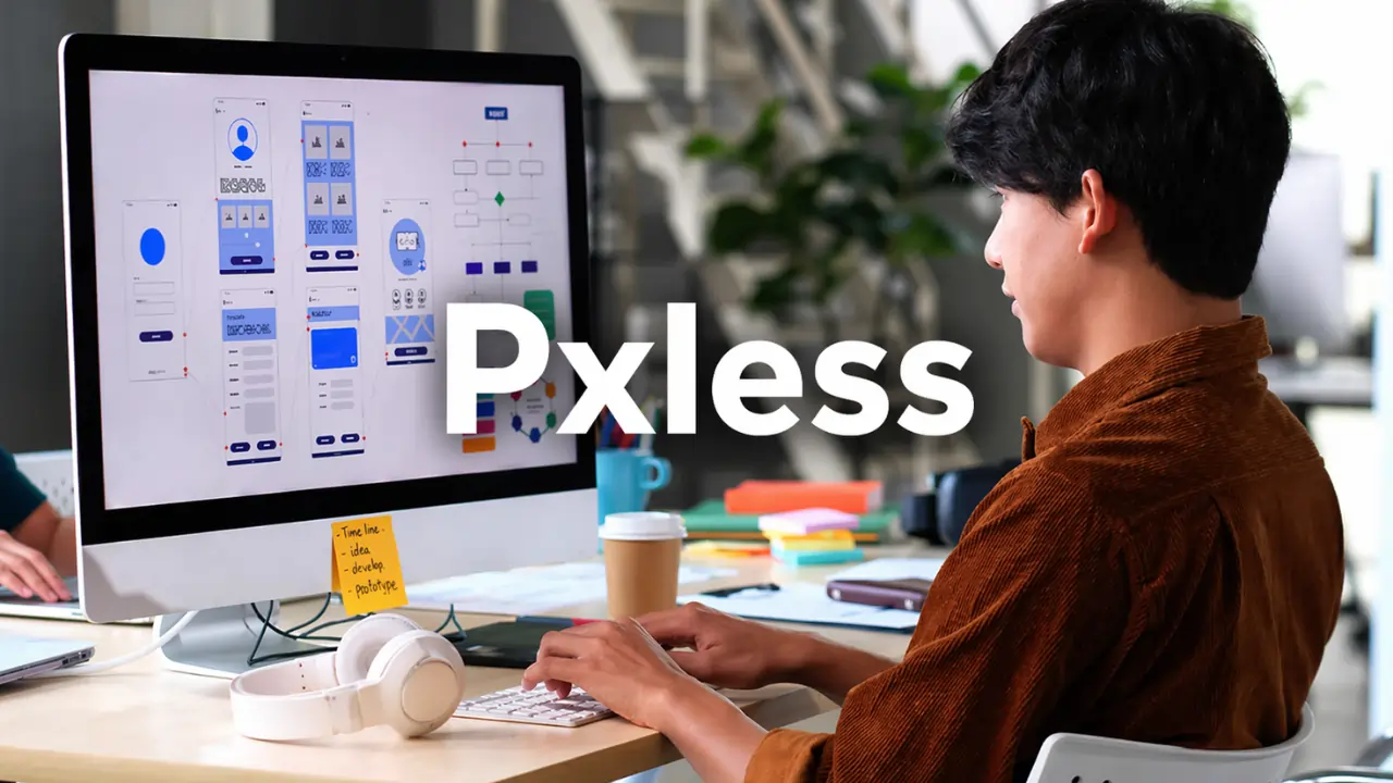
Introduction
Digital design is no longer limited to a single screen size or device. From mobile phones to large desktop monitors and even smart devices, users interact with interfaces in many different ways. This shift has pushed designers and developers to move beyond rigid layouts. One approach gaining attention is pxless, a concept that focuses on flexibility instead of fixed measurements.
Pxless is changing how interfaces are built by removing the dependency on pixel-based layouts and replacing it with scalable and adaptive design systems that respond naturally to different environments.
What is Pxless
Pxless is a design and development approach that avoids fixed pixel units and uses flexible, relative measurements to build layouts. Instead of defining elements with exact pixel values, pxless relies on units like percentages, rem, em, and viewport-based sizing.
This allows content to adjust smoothly across various screen sizes without breaking the layout. Pxless focuses on how elements behave rather than forcing them into strict dimensions. The result is a more natural and consistent user experience across devices.
Why Pxless Matters in Today’s Digital World
The number of devices used to access websites and applications has increased rapidly. A layout that works perfectly on one device may fail on another if it depends heavily on pixel precision. Pxless solves this issue by allowing designs to adapt instead of forcing consistency through fixed values.
Another important factor is user behavior. People often zoom in, change font sizes, or use accessibility tools. Pxless supports these actions by making designs flexible enough to adjust without losing structure or readability.
Core Principles of Pxless Design
Flexibility Over Fixed Layouts
Pxless prioritizes adaptable layouts that respond to different screen sizes instead of staying locked in place.
Content-Driven Structure
The layout is built around the content, not around predefined screen dimensions.
Use of Relative Units
Instead of pixels, pxless uses scalable units such as percentages and rem to ensure consistent proportions.
Scalability
Design elements grow or shrink smoothly depending on the viewing environment.
Accessibility Focus
Pxless makes it easier for users to interact with content regardless of their device settings or limitations.
Technologies That Enable Pxless
CSS Flexbox and Grid
These tools allow developers to create dynamic layouts where elements adjust based on available space.
Relative Measurement Units
Units like rem, em, vw, vh, and percentages are essential for building pxless layouts.
Container Queries
Components can respond to their parent container instead of the entire screen, making layouts more flexible.
Design Systems and Components
Reusable components help maintain consistency while still allowing flexibility in layout behavior.
Benefits of Pxless Design
Better Responsiveness
Pxless ensures that layouts work across different devices without needing multiple fixed breakpoints.
Improved Accessibility
Users can adjust display settings such as font size or zoom without breaking the layout.
Long-Term Scalability
As new devices are introduced, pxless designs continue to function without major changes.
Reduced Maintenance Effort
Flexible systems are easier to update compared to rigid pixel-based designs.
Enhanced User Experience
Users experience smoother interactions because the design adapts naturally to their environment.
Challenges of Pxless
Learning Curve
Designers and developers who are used to pixel-perfect layouts may find it difficult to shift to pxless thinking.
Requires Planning
Without a proper system, flexible layouts can become inconsistent.
Testing Requirements
Designs must be tested across multiple devices and conditions to ensure stability.
Less Visual Control
Exact spacing and alignment may vary slightly across different screens.
Pxless vs Pixel-Based Design
Pixel-based design focuses on exact measurements and visual precision. While this works well for static designs, it becomes limiting when applied to modern multi-device environments.
Pxless, on the other hand, focuses on adaptability. Instead of trying to make every screen look identical, it ensures that every screen delivers a functional and consistent experience. This makes pxless more suitable for modern web and app development.
Real-World Applications of Pxless
Responsive Websites
Modern websites use pxless techniques to adjust layouts for mobile, tablet, and desktop users.
Mobile Applications
Apps designed with flexible layouts provide a better experience across different screen sizes.
Design Systems
Large platforms use pxless principles to maintain consistency across multiple products.
Emerging Technologies
Devices like smart TVs, wearables, and foldable screens benefit from pxless adaptability.
Future of Pxless Design
The future of digital design is moving toward systems that are flexible, scalable, and user-focused. Pxless aligns perfectly with this direction. As devices continue to evolve, the need for adaptable layouts will increase.
Designers and developers who adopt pxless early will be better prepared to handle the challenges of future technologies. It is not just a trend but a practical approach to building long-lasting digital experiences.
Conclusion
Pxless represents a shift from rigid, pixel-based thinking to a more flexible and scalable approach. By focusing on adaptability, it allows designs to work seamlessly across different devices and user settings.
This approach improves accessibility, reduces maintenance, and creates better user experiences. As digital platforms continue to grow, pxless will play an important role in shaping how modern interfaces are designed.
FAQs
1. What does pxless mean?
Pxless refers to a design approach that avoids fixed pixel values and focuses on flexible, scalable layouts using relative units.
2. How is pxless different from responsive design?
Responsive design often relies on breakpoints, while pxless focuses on fluid layouts that adapt continuously without strict breakpoints.
3. Is pxless suitable for beginners?
Yes, but it requires learning modern CSS techniques like Flexbox, Grid, and relative units.
4. Why is pxless important for accessibility?
Pxless allows layouts to adjust based on user settings such as zoom and font size, improving usability for all users.
5. Can pxless be used in all types of projects?
Yes, pxless can be applied to websites, mobile apps, and even advanced interfaces like smart devices, making it a versatile approach.
You May Also Read: Florncelol: Meaning, Origin and Why It’s Trending Online